
Instagram's New Logo: What Social Media Marketers Actually Need to Know
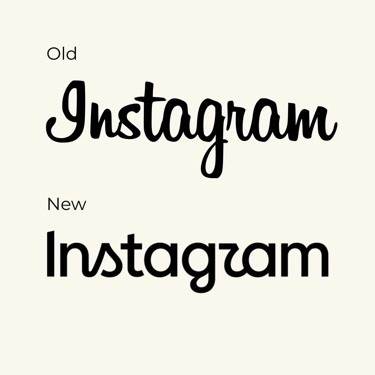
Instagram unveiled a redesigned wordmark on 13 August 2026, its first logo update in ten years. The change replaces the familiar cursive lettering at the top of the app with what Instagram CEO Adam Mosseri described as "sharper and more modern".
The gradient camera icon on your phone is staying put. It's the text above the feed, the wordmark, that has been updated for the first time in ten years.
The internet's immediate response? "Instagzam". Users latched onto the stylized "r" in the new logo, joking it could be easily confused with a "z", while others compared the design to AI-generated lettering.
But the jokes obscure the actual story. For social media marketers, this isn't about whether you like the new curves on the "s." It's about what Instagram is signalling with this refresh, why it's happening now, and what you need to change in your own assets.
What actually changed
The new typeface is more compact and bolder, and the letters "s," "r," and "g" appear significantly rounder than before. The lettering sits somewhere between cursive and print, with smoother strokes and a more compact overall shape.
The brand refresh includes three typeface families: Instagram Sans, Instagram Pen, and Instagram Mono. Instagram Sans has been updated, Instagram Pen is a new handwriting typeface, and Instagram Mono is a new monospaced font.
The app icon remains unchanged, but the colour gradient will be used more sparingly in the future.
The new wordmark won't be rolled out worldwide all at once, but gradually throughout 2026.
Why this matters (beyond the memes)
Instagram hit 3 billion monthly active users in September 2025, up from 2 billion in 2022. A logo this visible doesn't get changed on a whim.
The redesign follows similar updates Meta previously implemented for Facebook and Threads, bringing Instagram's visual identity closer to the rest of the Meta family. That alignment is the real clue. Instagram isn't just refreshing a decade-old typeface because it looked dated. It's consolidating its position within Meta's broader ecosystem.
Instagram is revamping its logo at the same time it focuses more on Reels, messaging and recommendations. The platform hasn't been a photo-sharing app for years. Ten years on, the app has moved again, further and faster. It is a video feed, a messaging tool and a shopping surface.
The 2016 rebrand dropped the vintage camera icon because Instagram had outgrown being a filter app. This one lands as Instagram becomes a video and commerce platform that happens to have photos in it.
What social media marketers should do next
If you're managing an Instagram presence for a brand, you have work to do. Not urgent, but real.
Update your branded templates and guidelines
If your social templates, pitch decks, or brand guidelines reference the old Instagram wordmark, flag them for updating. The rollout is gradual throughout 2026, so you won't see the new logo everywhere immediately, but your assets should reflect the current version once it appears in your region.
Don't chase the controversy
The "Instagzam" jokes are loud, but the name "Instagram" is such a recognisable brand that most people will immediately know what this says. Instagram's overall brand recognition is far too strong for minor font tweaks to confuse users.
Resist the urge to make the logo debate your content hook unless you have a genuinely original angle. The obvious take has already been said a thousand times.
Watch for further changes
Meta declined to say whether a new app icon is coming. That non-answer is the most interesting line in the story.
Brand refreshes tend to arrive alongside something else. They accompany a repositioning, a merger, a pivot, or a period when a company would like the conversation to be about how it looks.
This wordmark change might be the first visible piece of something larger. Keep an eye on product updates, feature launches, and shifts in how Instagram talks about itself over the coming months.
The wordmark at the top of the app hasn't changed in 10 years, so it was time for a refresh.
Adam Mosseri, Head of InstagramThe rebranding playbook Instagram is following
For marketers considering their own rebrand or managing client rebrands on social, Instagram's approach offers a few transferable principles.
Anchor the change in evolution, not revolution. Script reflects individuality, Instagram's design director said, and the new wordmark is bolder and simpler, with touches of unexpectedness. The message is refinement, not rejection of what came before.
Accept that mixed reactions are the point. Mosseri seemed to be bracing for a strong reaction. In cross-posting the logo announcement on Threads, he wrote, "Thought I'd share this on Threads [too] and see what the hot takes might be". He knew what was coming. The debate is part of the visibility.
Roll out gradually where possible. The new wordmark is being introduced gradually throughout 2026, in the app, on the website, and in official materials. For a platform with 3 billion users, a phased rollout reduces the shock and gives teams time to adapt.
What this says about platform maturity
A wordmark seen every day by millions of people can become almost invisible through familiarity. Change a few curves and suddenly everyone is looking at it again, tracing the letters and arguing about what they say.
Instagram wanted attention, and it got it. But beyond the noise, the rebrand is a signal that Instagram sees itself differently now. It's no longer the scrappy photo app fighting for relevance. It's a mature, multi-format platform inside the world's largest social media company, and its visual identity now reflects that.
For social media marketers, the takeaway isn't whether you prefer the old logo. It's recognising that platforms evolve, and staying effective means tracking not just feature updates but the deeper shifts in how they position themselves.
The logo is just the visible part. The real story is always underneath it.